


Fluid Mixed Media Experience
Content Player, Auto Play, Mixed Digital Format
How I Process Design
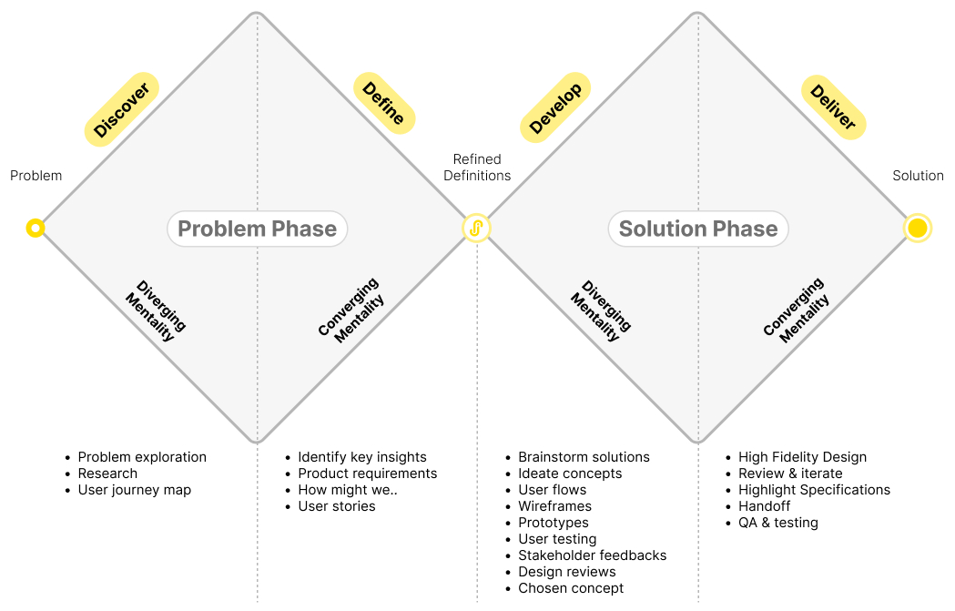
I use the Double Diamond as a guiding framework to better understand and communicate the design process. After exploring various articles and perspectives, I developed my own interpretation to help break down each stage clearly and make the process more intuitive for myself.
Research
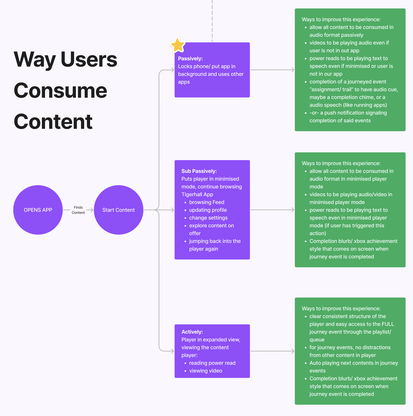
We looked into how users consume content, and identified 3 ways:
- Passively: Consuming content in the background
- Sub Passively: Puts player in minimised mode, while browsing other pages within the app
- Actively: Viewing a video or reading a power read in the app
In each of this methods identified, I identified and listed out ways of improving the experience.
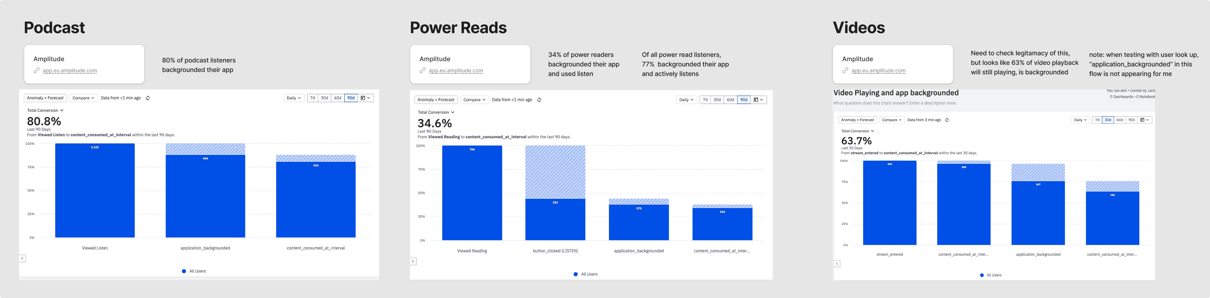
Using Amplitude, I created charts to analyze user behavior and found strong support for this direction: 80% of podcast listeners, 34% of power read users, and 63% of video viewers backgrounded the app during playback, indicating that most users wanted to consume content passively in the background although not all content were fully supported this way.
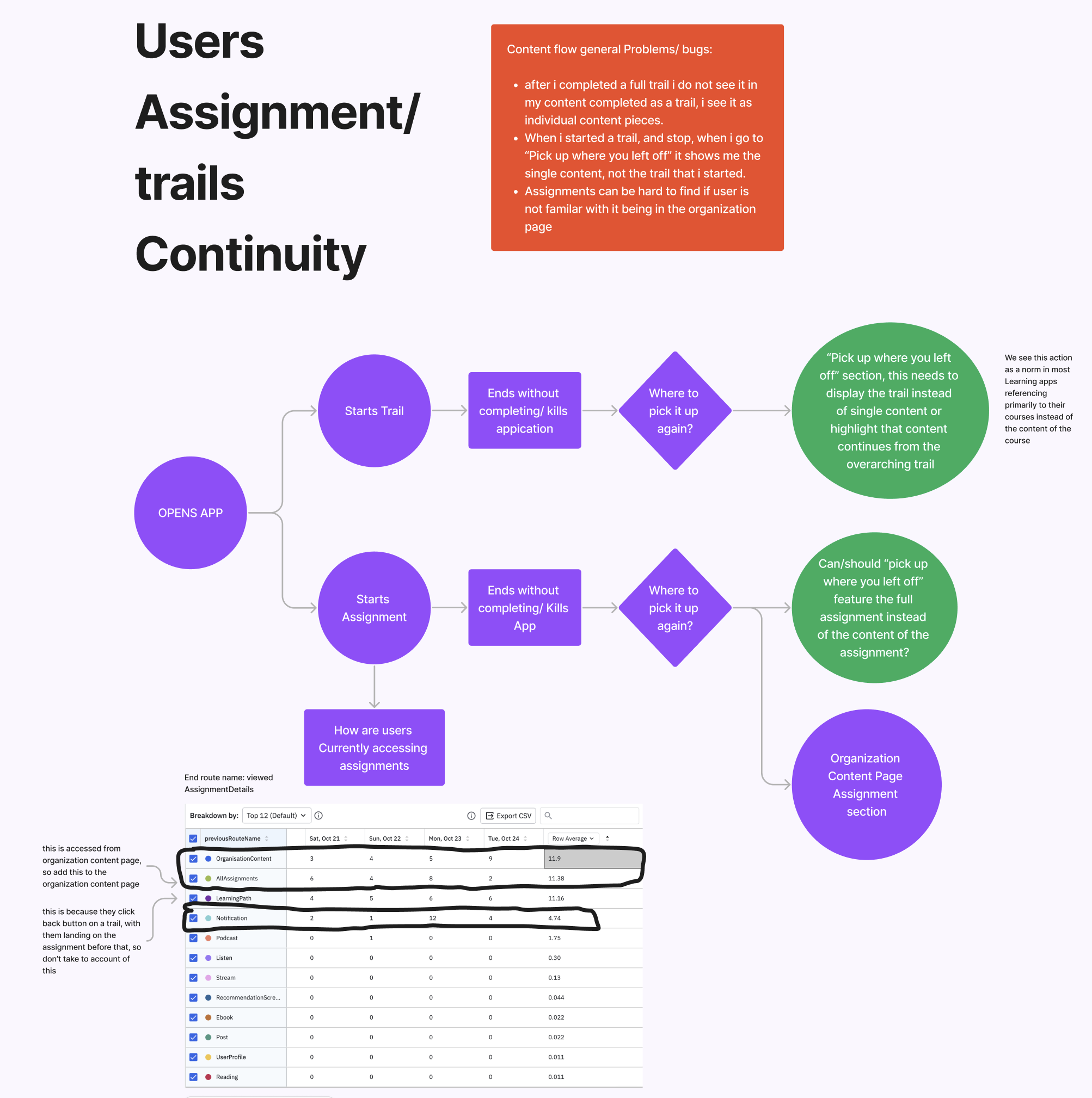
In addition to improving continuity, I explored how users resumed their progress in trails and assignments after previous sessions. This revealed a key issue: the "Pick up where you left off" section only surfaced standalone content, not content within a trail or assignment. As a result, users couldn’t easily continue their learning journeys from where they left off. (Work broke out to a seperate epic)
Brainstorming & Gathering Insights
I started mapping out several user flows, supported by reference screenshots to facilitate discussions with the product and engineering teams. These covered key areas including standalone content, trails and assignments
Designing
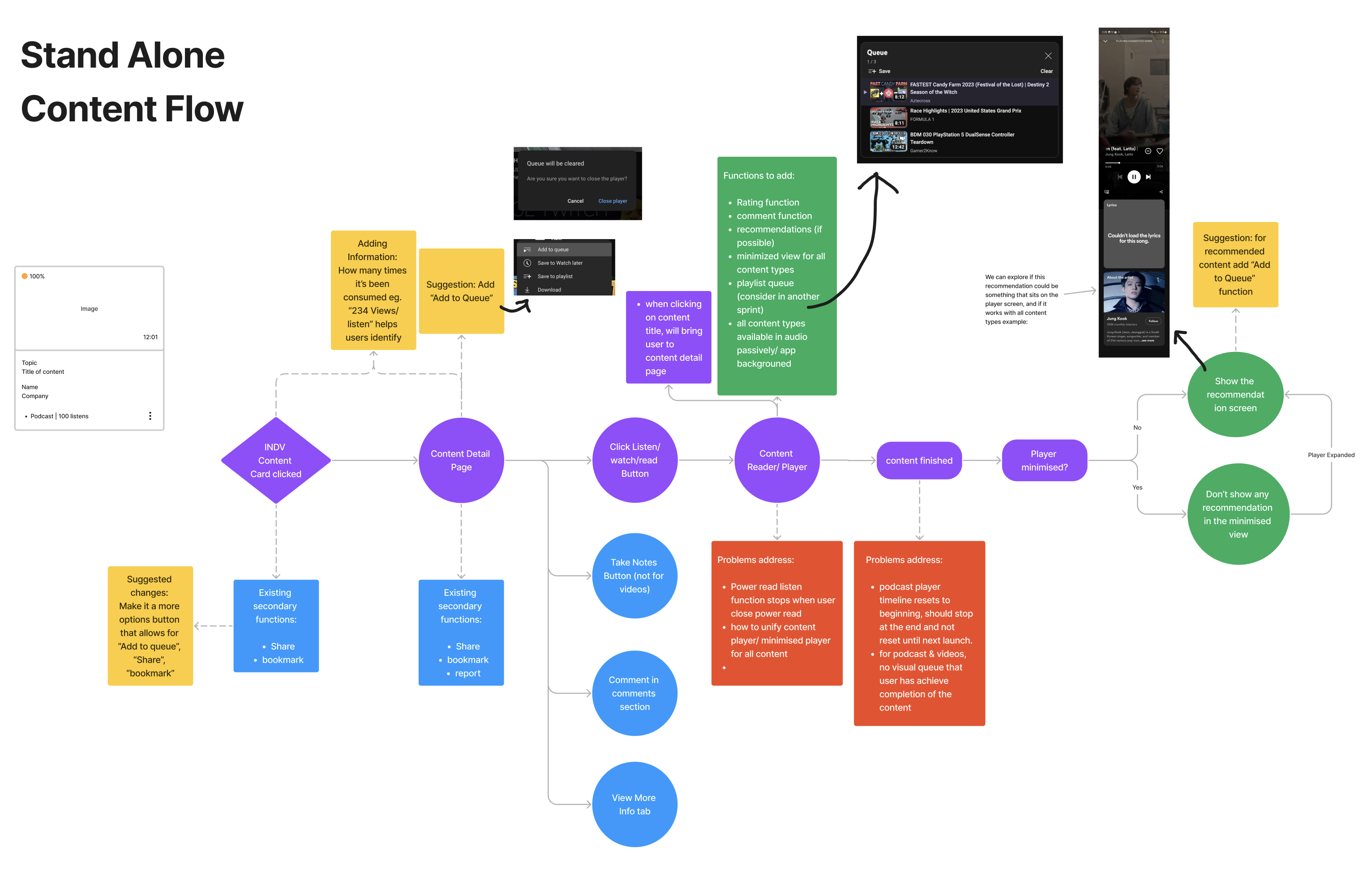
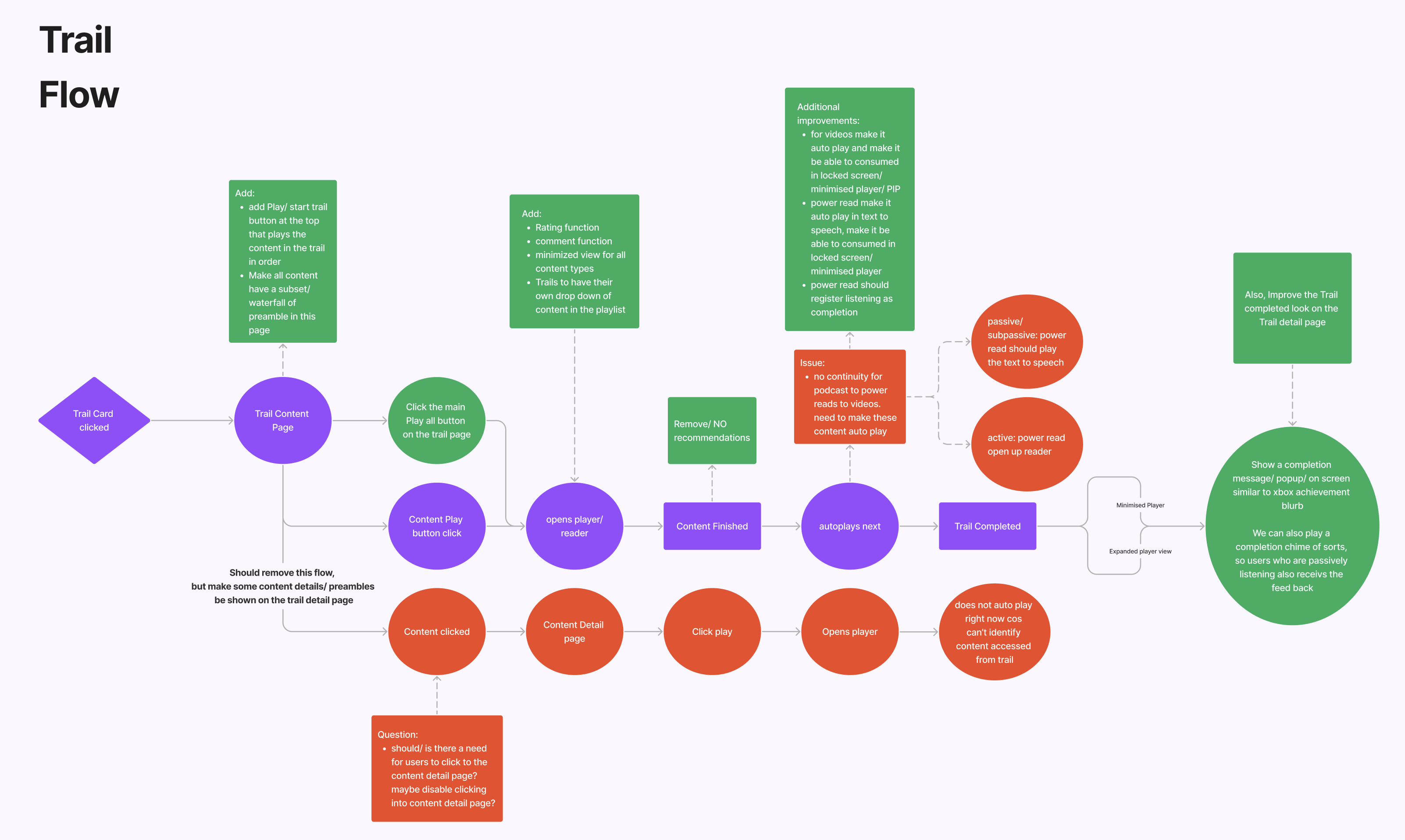
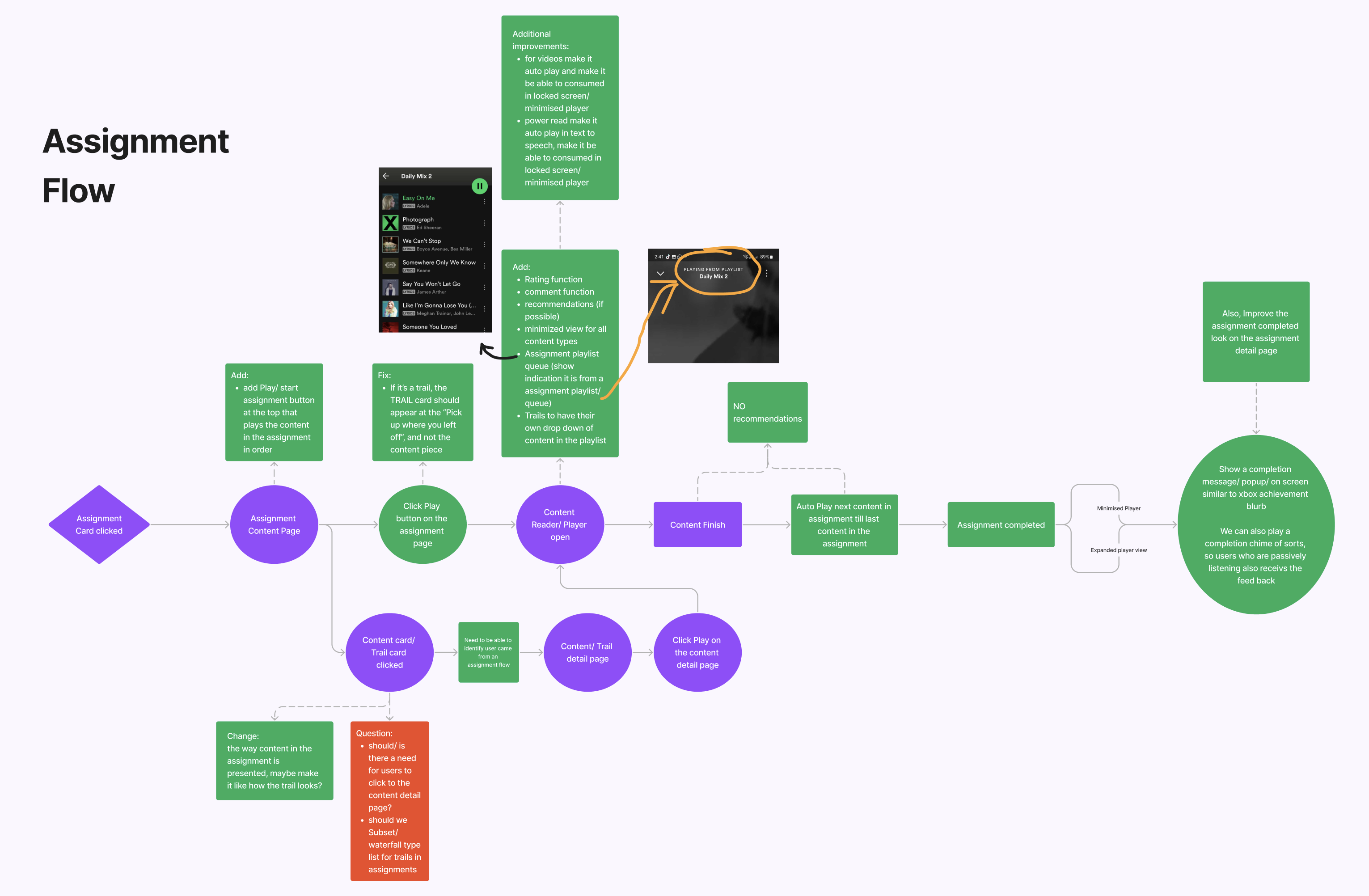
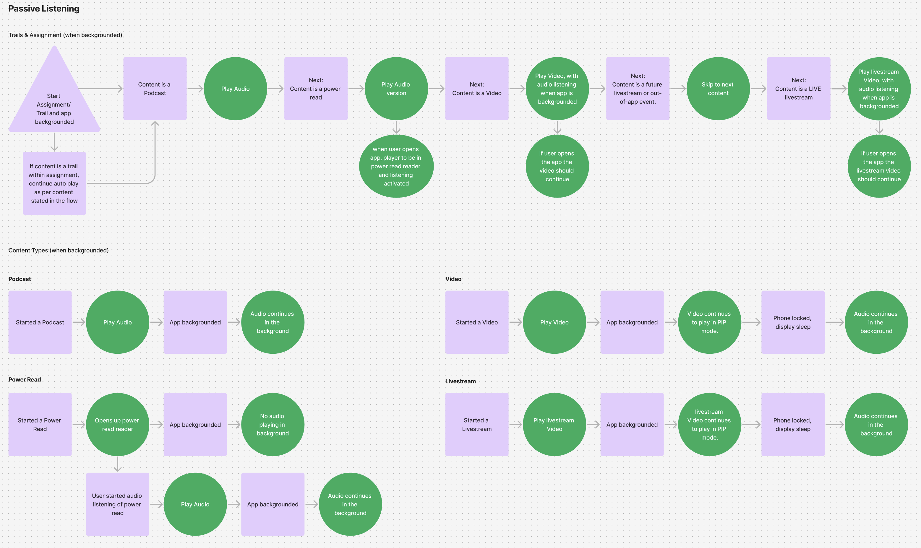
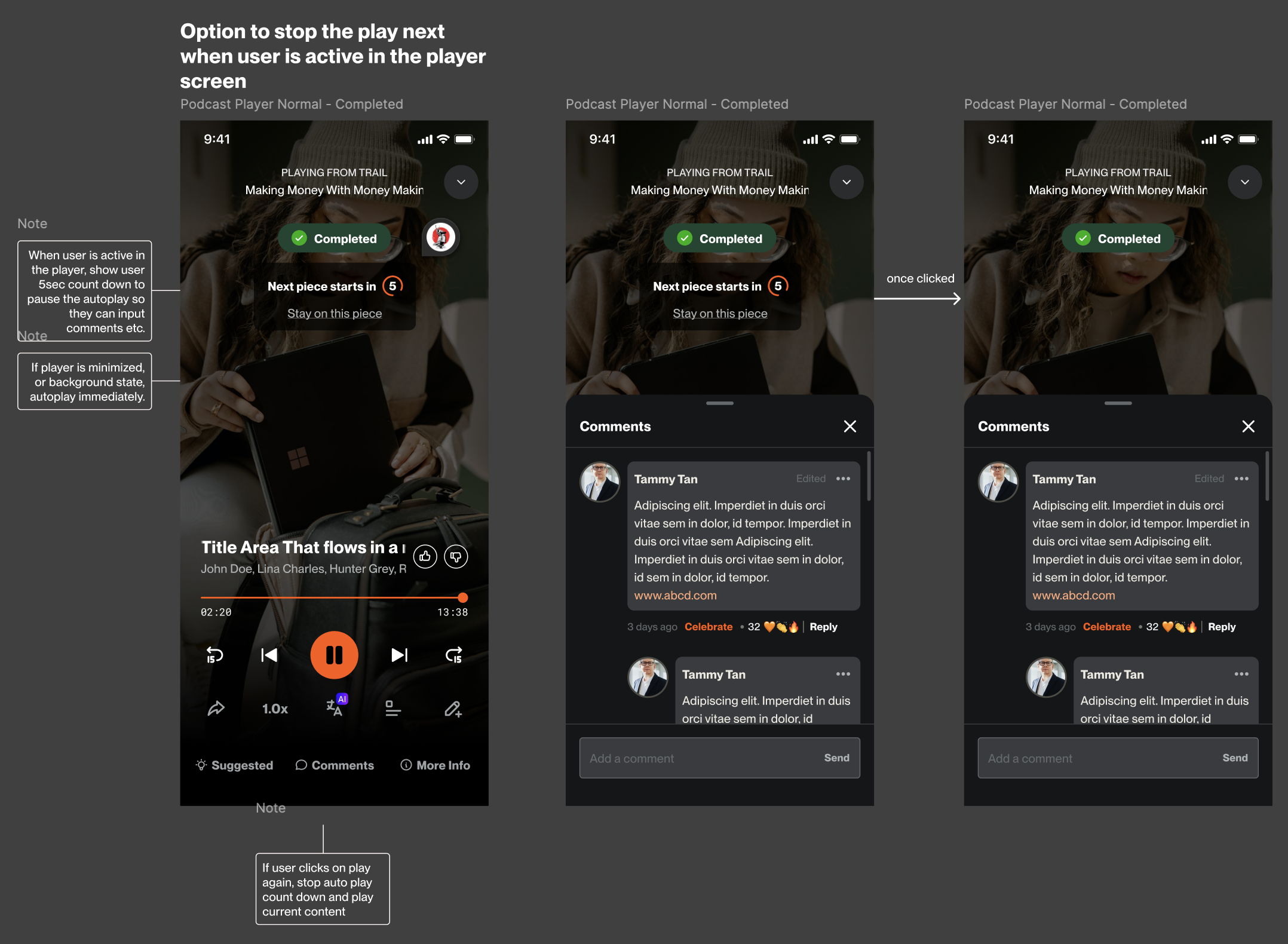
I designed a passive consumption flow that supports all content types including podcasts, power reads, videos, and livestreams, demonstrating how users engage in passive, sub-passive, and active modes. The flow helps engineers clearly understand the end-to-end experience in playlist-style formats like trails and assignments, including how the next content in the sequence plays automatically.
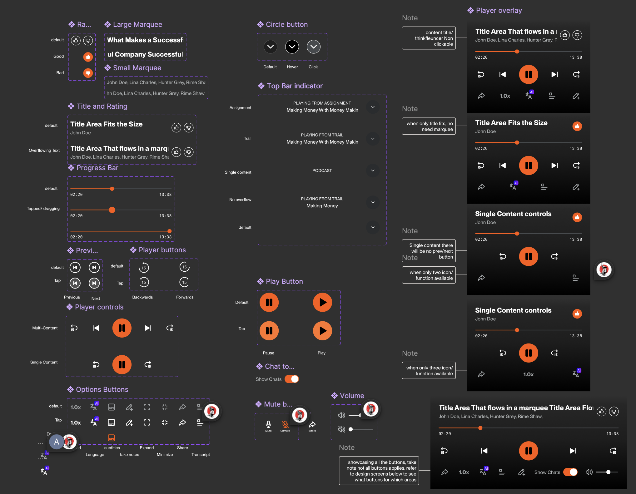
On Figma, I focused on creating a unified player experience, designing a player component that works across all content types. As the team is based on two-week sprint cycles, we follow values of a lean, agile workflow, often favouring high-fidelity mockups over wireframes as it gives us a better value of effort. This approach significantly sped up the process and provided a more accurate visual representation of our vision.
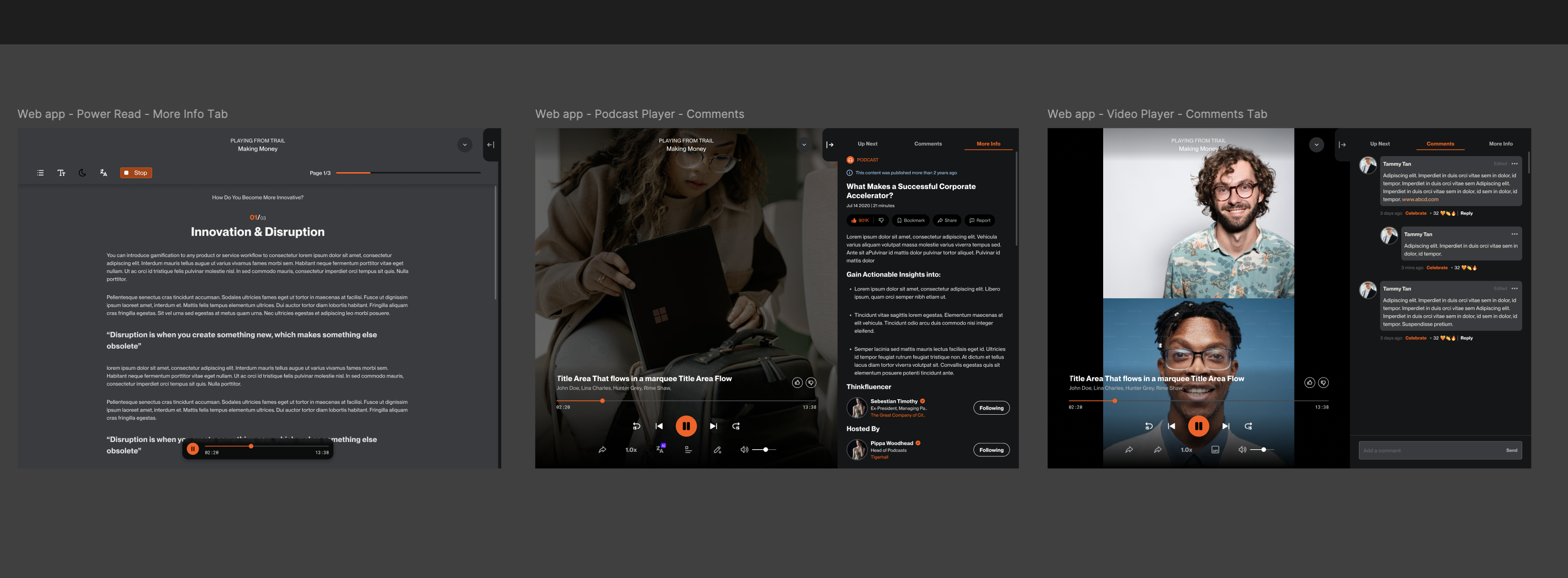
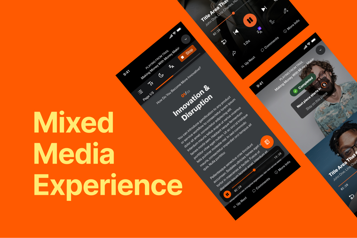
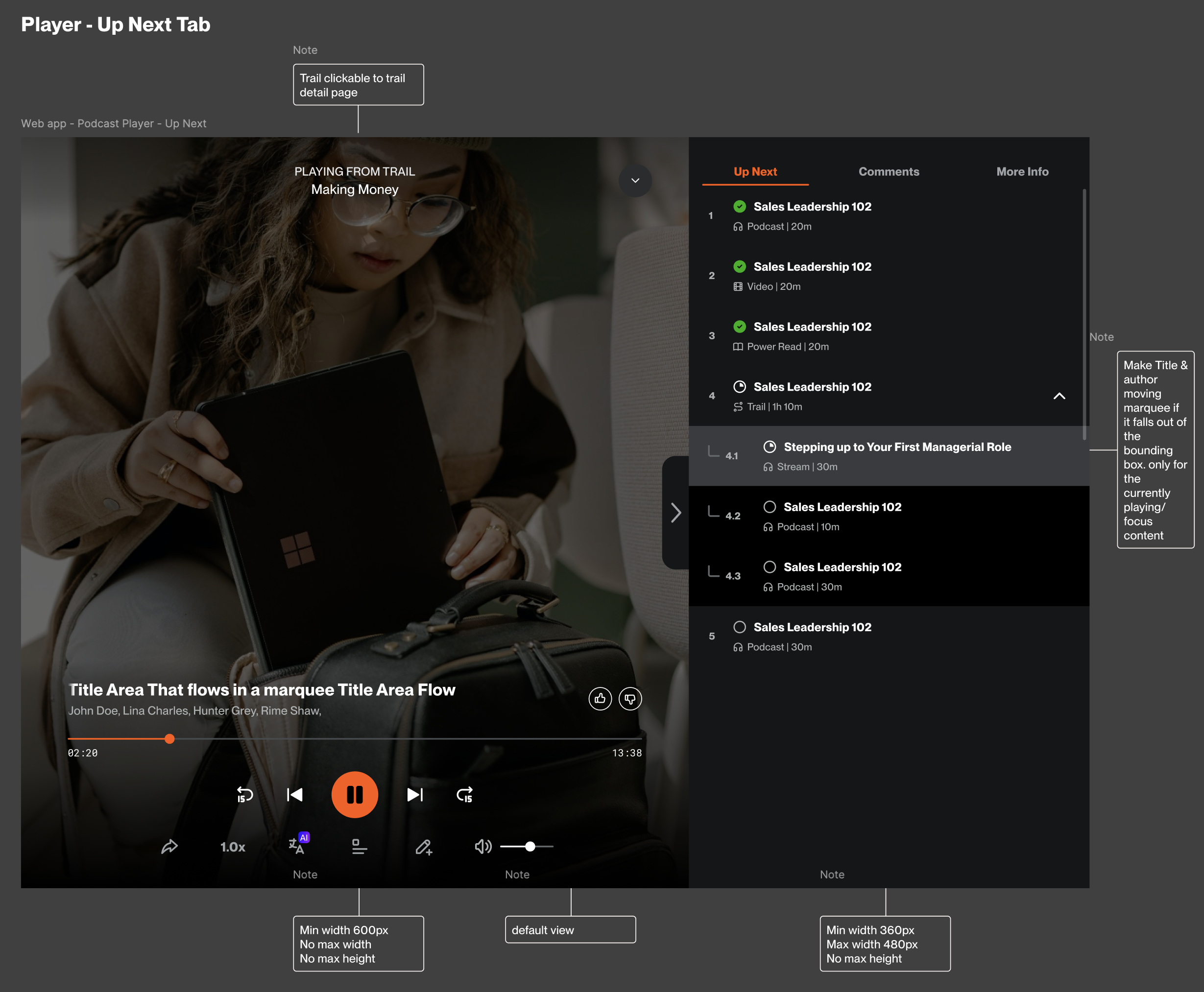
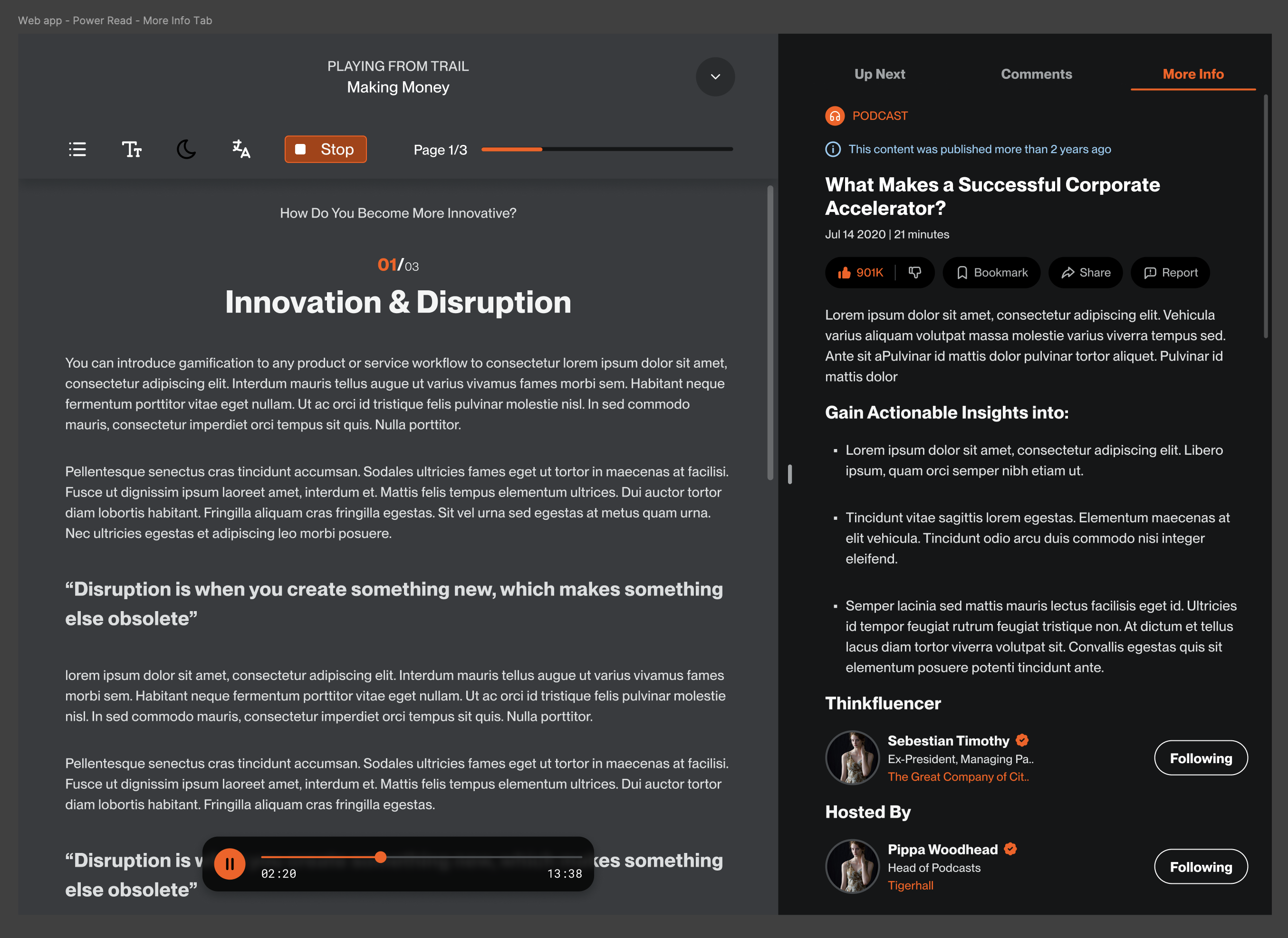
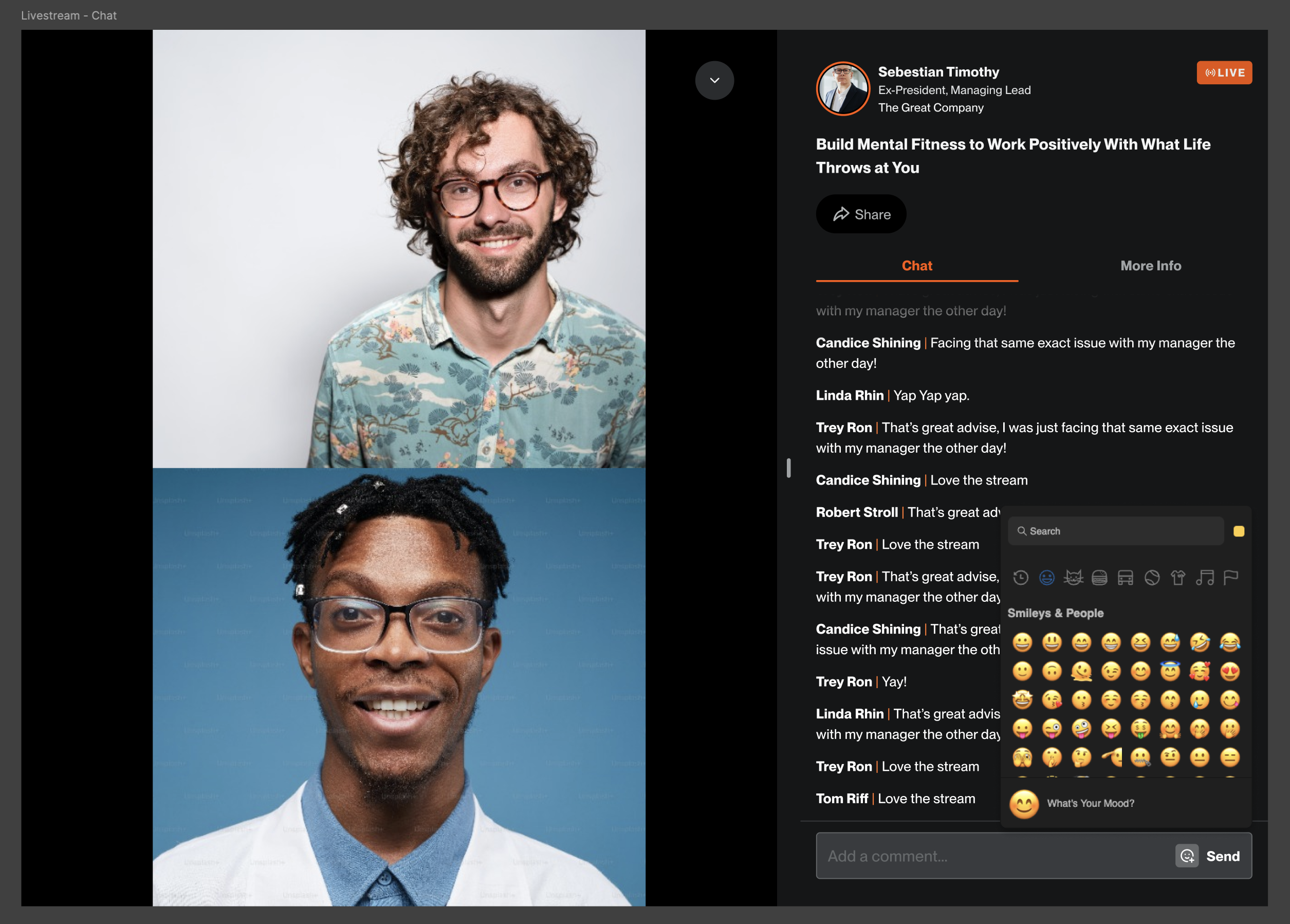
The player links content within a trail or assignment through a playlist panel labeled “Up Next.” It also includes a “More Info” tab for users to view details of each content, a “Comments” tab for easy engagement, and full media player controls for seamless content interaction.
The content player was designed to support audio, video, text, and livestream formats seamlessly.
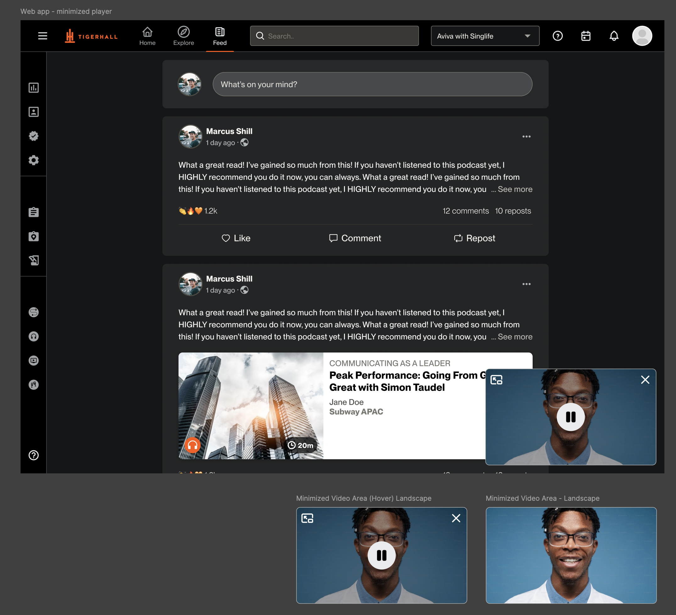
We already had a minimised player component, but we enhanced its functionality to support Power Reads when idle without audio, as well as to include a minimized video player.
The experience was completed with a landing page that appears when users click on any content from the homepage. A main start button lets users begin the playlist from the first item, while individual start buttons on each piece of content allow users to jump directly into their chosen starting point.

Designs were created for both the Web App and Mobile App, with development priority given to the Web App since it had higher user engagement compared to the Mobile App.
Handing Off
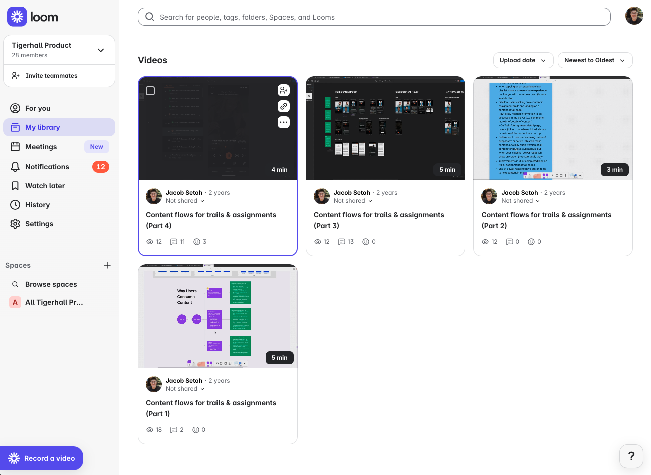
In addition to organizing the Product Requirements Documents and participating in numerous meetings with stakeholders and engineers, I recorded detailed four-part walkthroughs of my designs using Loom. These videos helped keep engineers aligned with the designs and made collaboration more efficient across the team.
Analysis
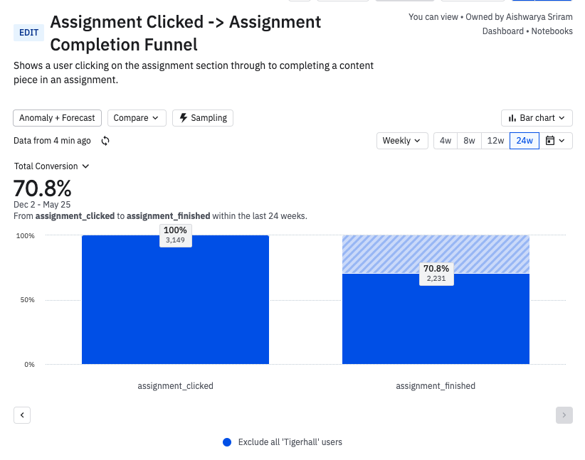
Overall, the improved flow significantly enhanced the user experience for Trails and Assignments. Over time, we observed a steady increase in completion rates on Amplitude, with 70% of users who started an Assignment going on to complete it.
More Projects


Fluid Mixed Media Experience
Content Player, Auto Play, Mixed Digital Format
Overview
Tigerhall began as content platform led by industry experts known as "Thinkfluencers", serving B2C customers using podcasts, videos, livestreams and power reads. It has since evolved towards a B2B tool for organisations to drive change activation initiatives through organisation created content, assigning content tasks, statistics and report builders.
Role
Product Designer
Product research, UX research, UI design
How I Process Design
I use the Double Diamond as a guiding framework to better understand and communicate the design process. After exploring various articles and perspectives, I developed my own interpretation to help break down each stage clearly and make the process more intuitive for myself.
Research
We looked into how users consume content, and identified 3 ways:
- Passively: Consuming content in the background
- Sub Passively: Puts player in minimised mode, while browsing other pages within the app
- Actively: Viewing a video or reading a power read in the app
In each of this methods identified, I identified and listed out ways of improving the experience.
Using Amplitude, I created charts to analyze user behavior and found strong support for this direction: 80% of podcast listeners, 34% of power read users, and 63% of video viewers backgrounded the app during playback, indicating that most users wanted to consume content passively in the background although not all content were fully supported this way.
In addition to improving continuity, I explored how users resumed their progress in trails and assignments after previous sessions. This revealed a key issue: the "Pick up where you left off" section only surfaced standalone content, not content within a trail or assignment. As a result, users couldn’t easily continue their learning journeys from where they left off. (Work broke out to a seperate epic)
Brainstorming & Gathering Insights
I started mapping out several user flows, supported by reference screenshots to facilitate discussions with the product and engineering teams. These covered key areas including standalone content, trails and assignments
Designing
I designed a passive consumption flow that supports all content types including podcasts, power reads, videos, and livestreams, demonstrating how users engage in passive, sub-passive, and active modes. The flow helps engineers clearly understand the end-to-end experience in playlist-style formats like trails and assignments, including how the next content in the sequence plays automatically.
On Figma, I focused on creating a unified player experience, designing a player component that works across all content types. As the team is based on two-week sprint cycles, we follow values of a lean, agile workflow, often favouring high-fidelity mockups over wireframes as it gives us a better value of effort. This approach significantly sped up the process and provided a more accurate visual representation of our vision.
The player links content within a trail or assignment through a playlist panel labeled “Up Next.” It also includes a “More Info” tab for users to view details of each content, a “Comments” tab for easy engagement, and full media player controls for seamless content interaction.
The content player was designed to support audio, video, text, and livestream formats seamlessly.
We already had a minimised player component, but we enhanced its functionality to support Power Reads when idle without audio, as well as to include a minimized video player.
The experience was completed with a landing page that appears when users click on any content from the homepage. A main start button lets users begin the playlist from the first item, while individual start buttons on each piece of content allow users to jump directly into their chosen starting point.
Designs were created for both the Web App and Mobile App, with development priority given to the Web App since it had higher user engagement compared to the Mobile App.
Handing Off
In addition to organizing the Product Requirements Documents and participating in numerous meetings with stakeholders and engineers, I recorded detailed four-part walkthroughs of my designs using Loom. These videos helped keep engineers aligned with the designs and made collaboration more efficient across the team.
Analysis
Overall, the improved flow significantly enhanced the user experience for Trails and Assignments. Over time, we observed a steady increase in completion rates on Amplitude, with 70% of users who started an Assignment going on to complete it.
More Projects


Fluid Mixed Media Experience
Content Player, Auto Play, Mixed Digital Format
Overview
Tigerhall began as content platform led by industry experts known as "Thinkfluencers", serving B2C customers using podcasts, videos, livestreams and power reads. It has since evolved towards a B2B tool for organisations to drive change activation initiatives through organisation created content, assigning content tasks, statistics and report builders.
Role
Product Designer
Product research, UX research, UI design
How I Process Design
I use the Double Diamond as a guiding framework to better understand and communicate the design process. After exploring various articles and perspectives, I developed my own interpretation to help break down each stage clearly and make the process more intuitive for myself.
Research
We looked into how users consume content, and identified 3 ways:
- Passively: Consuming content in the background
- Sub Passively: Puts player in minimised mode, while browsing other pages within the app
- Actively: Viewing a video or reading a power read in the app
In each of this methods identified, I identified and listed out ways of improving the experience.
Using Amplitude, I created charts to analyze user behavior and found strong support for this direction: 80% of podcast listeners, 34% of power read users, and 63% of video viewers backgrounded the app during playback, indicating that most users wanted to consume content passively in the background although not all content were fully supported this way.
In addition to improving continuity, I explored how users resumed their progress in trails and assignments after previous sessions. This revealed a key issue: the "Pick up where you left off" section only surfaced standalone content, not content within a trail or assignment. As a result, users couldn’t easily continue their learning journeys from where they left off. (Work broke out to a separate epic)
Brainstorming & Gathering Insights
I started mapping out several user flows, supported by reference screenshots to facilitate discussions with the product and engineering teams. These covered key areas including standalone content, trails and assignments
Designing
I designed a passive consumption flow that supports all content types including podcasts, power reads, videos, and livestreams, demonstrating how users engage in passive, sub-passive, and active modes. The flow helps engineers clearly understand the end-to-end experience in playlist-style formats like trails and assignments, including how the next content in the sequence plays automatically.
On Figma, I focused on creating a unified player experience, designing a player component that works across all content types. As the team is based on two-week sprint cycles, we follow values of a lean, agile workflow, often favouring high-fidelity mockups over wireframes as it gives us a better value of effort. This approach significantly sped up the process and provided a more accurate visual representation of our vision.
The player links content within a trail or assignment through a playlist panel labeled “Up Next.” It also includes a “More Info” tab for users to view details of each content, a “Comments” tab for easy engagement, and full media player controls for seamless content interaction.
The content player was designed to support audio, video, text, and livestream formats seamlessly.
We already had a minimised player component, but we enhanced its functionality to support Power Reads when idle without audio, as well as to include a minimized video player.
The experience was completed with a landing page that appears when users click on any content from the homepage. A main start button lets users begin the playlist from the first item, while individual start buttons on each piece of content allow users to jump directly into their chosen starting point.
Designs were created for both the Web App and Mobile App, with development priority given to the Web App since it had higher user engagement compared to the Mobile App.
Handing Off
In addition to organizing the Product Requirements Documents and participating in numerous meetings with stakeholders and engineers, I recorded detailed four-part walkthroughs of my designs using Loom. These videos helped keep engineers aligned with the designs and made collaboration more efficient across the team.
Analysis
Overall, the improved flow significantly enhanced the user experience for Trails and Assignments. Over time, we observed a steady increase in completion rates on Amplitude, with 70% of users who started an Assignment going on to complete it.
More Projects
