


Design System: White Labeling with Support for Dark and Light Themes
Design system, Semantic Tokens, Variables
Understand
The product team conducted discussions to identify key issues and areas for improvement, utilizing a FigJam board and a Confluence page to help with collaboration.
The discussions covered:
- Understanding goals and needs of the team
- Identifying pain points and limitations of the current design system
- Assessing the potential impact of proposed improvements

Research
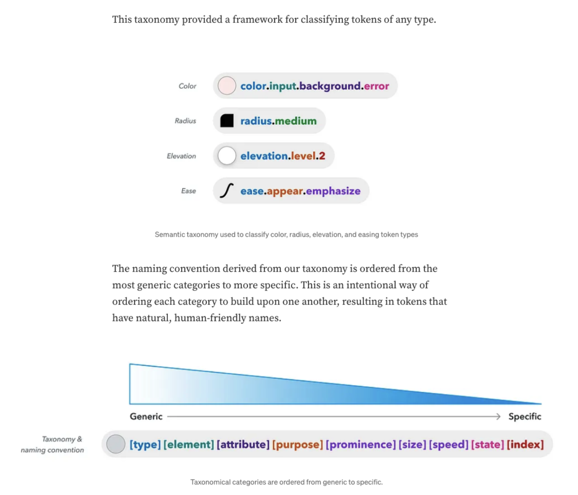
Through our research on design systems, we discovered that using variable tokens, a clear taxonomy, and layered collections provides an effective way to organize diverse needs. We determined that tokens should strike a balance between generic and specific as being too specific limits scalability.
Narrowing the Scope & Prioritising
We defined the specific tasks to focus on and maintained a central document in Confluence to record decisions as they arose during ongoing discussions.

Brainstorming & Gathering Insights
To ensure the design system aligned with the engineering team’s language, we held collaborative discussions on token taxonomy and the structure of colour tokens.

We established a solid starting structure that keeps the taxonomy purposeful for its intended use while ensuring it remains scalable for component implementation.
Implementing the Solution
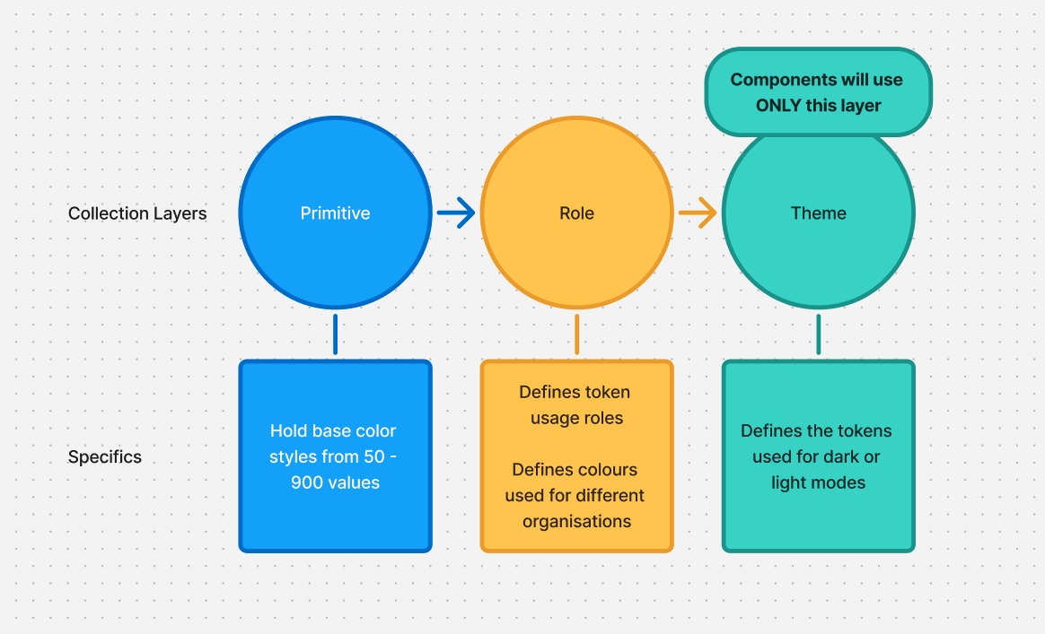
We began creating collection layers in Figma using variables. By leveraging the links between each layer, we set up tokens to interact with one another and clearly define their usage at each level.
Primitive Tokens
At this collection layer, we created all the basic color styles. These tokens don’t directly serve design purposes yet but ensure consistent color values throughout.

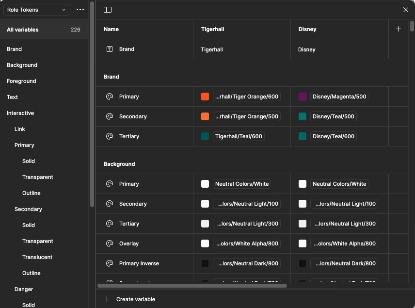
Role Tokens
The role tokens layer assigns purpose and usage to the tokens defined in the primitive layer. This ranges from generic values, such as the primary background color, to specific ones like the text color for link buttons. In this layer, we also created different ‘modes’ to define an organization’s colors for interactive token values.
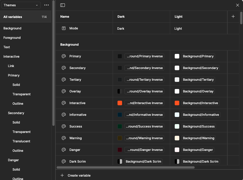
Theme Tokens
Finally, in the theme tokens layer, we map the tokens from the role tokens layer to both light and dark modes. This is the only layer from which components will source their values.
Outcome
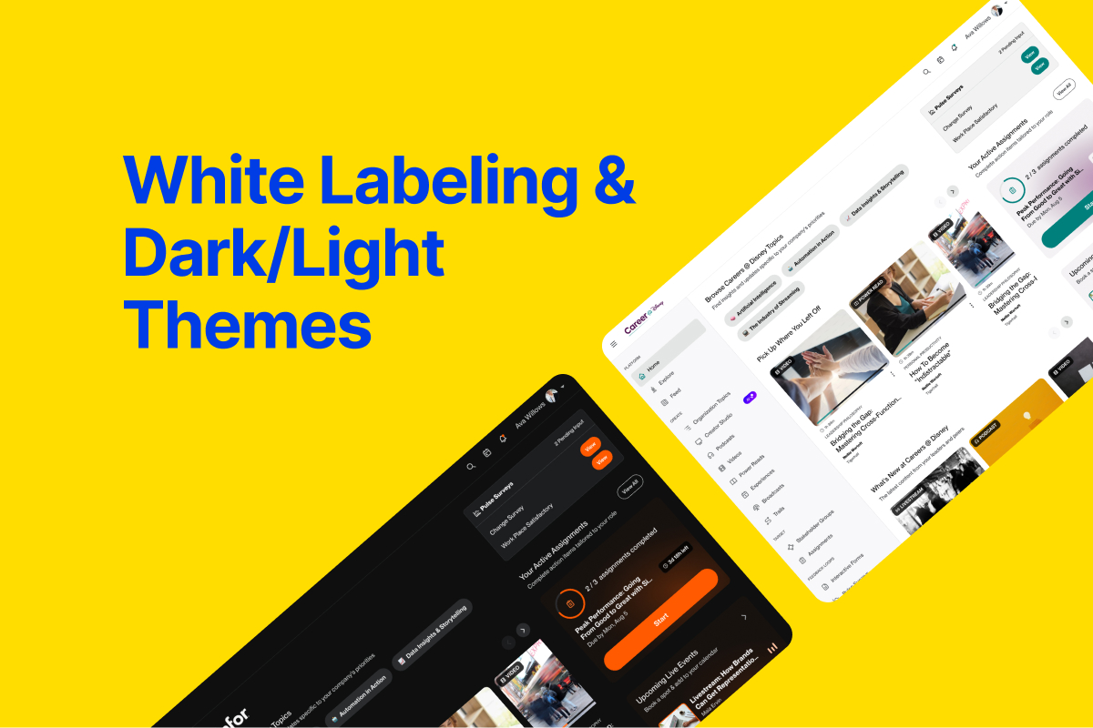
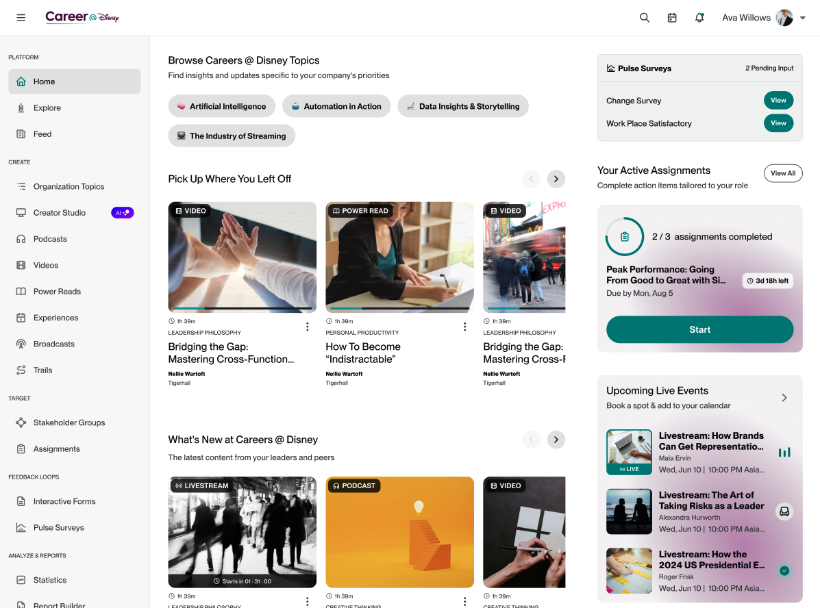
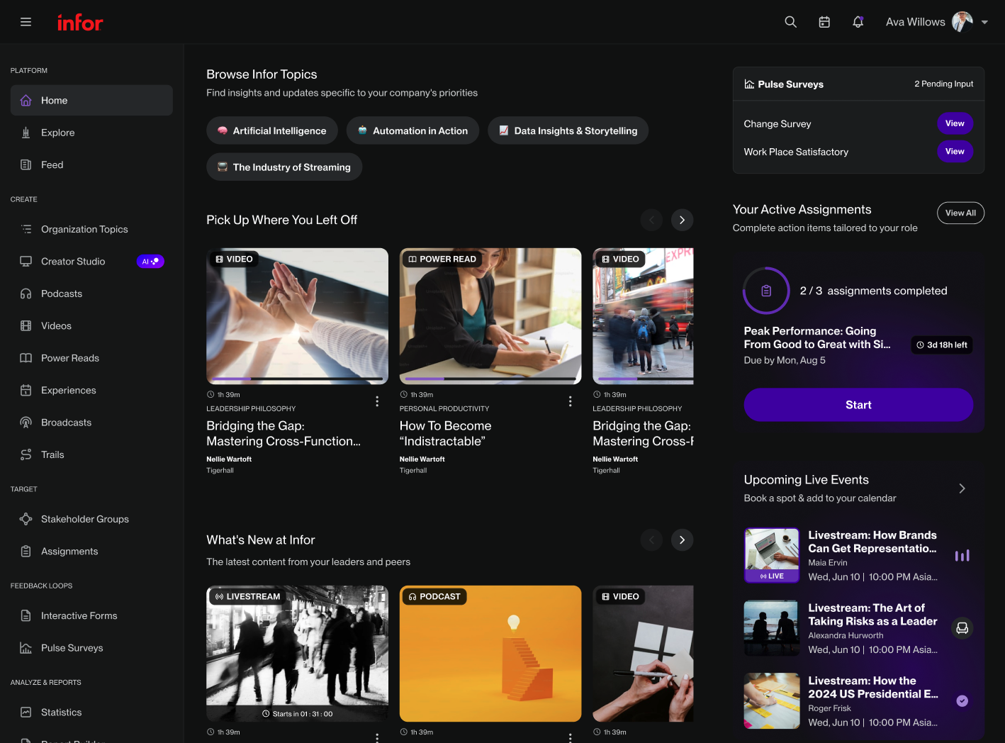
With the tokens in place, we can easily scale designs, enabling quick switching of an organization’s branding or toggling between light and dark themes all within Figma’s ‘Appearance’ panel. Additionally, future updates can be efficiently implemented by exporting a JSON file that developers can use directly in development.

Example of tokens applied across different organizations and light/dark modes on the platform’s homepage:
More Projects


Design System: White Labeling with Support for Dark and Light Themes
Design system, Semantic Tokens, Variables
Overview
Tigerhall began as content platform led by industry experts known as "Thinkfluencers", serving B2C customers using podcasts, videos, livestreams and power reads. It has since evolved towards a B2B tool for organisations to drive change activation initiatives through organisation created content, assigning content tasks, statistics and report builders.
Role
Product Designer
Product research, Design system structure, UI Design
Understand
The product team conducted discussions to identify key issues and areas for improvement, utilizing a FigJam board and a Confluence page to help with collaboration.
The discussions covered:
- Understanding goals and needs of the team
- Identifying pain points and limitations of the current design system
- Assessing the potential impact of proposed improvements
Research
Through our research on design systems, we discovered that using variable tokens, a clear taxonomy, and layered collections provides an effective way to organize diverse needs. We determined that tokens should strike a balance between generic and specific as being too specific limits scalability.
Narrowing the Scope & Prioritising
We defined the specific tasks to focus on and maintained a central document in Confluence to record decisions as they arose during ongoing discussions.
Brainstorming & Gathering Insights
To ensure the design system aligned with the engineering team’s language, we held collaborative discussions on token taxonomy and the structure of colour tokens.
We established a solid starting structure that keeps the taxonomy purposeful for its intended use while ensuring it remains scalable for component implementation.
Implementing the Solution
We began creating collection layers in Figma using variables. By leveraging the links between each layer, we set up tokens to interact with one another and clearly define their usage at each level.
Primitive Tokens
At this collection layer, we created all the basic color styles. These tokens don’t directly serve design purposes yet but ensure consistent color values throughout.
Role Tokens
The role tokens layer assigns purpose and usage to the tokens defined in the primitive layer. This ranges from generic values, such as the primary background color, to specific ones like the text color for link buttons. In this layer, we also created different ‘modes’ to define an organization’s colors for interactive token values.
Theme Tokens
Finally, in the theme tokens layer, we map the tokens from the role tokens layer to both light and dark modes. This is the only layer from which components will source their values.
Outcome
With the tokens in place, we can easily scale designs, enabling quick switching of an organization’s branding or toggling between light and dark themes all within Figma’s ‘Appearance’ panel. Additionally, future updates can be efficiently implemented by exporting a JSON file that developers can use directly in development.
Example of tokens applied across different organizations and light/dark modes on the platform’s homepage:
More Projects
